
Well it's called Honeysuckle and it's a vibrant and fun pink. I know most people loved 2010's turquoise... what's not to love about the colour of the sea, but what do you think about 'Honeysuckle'?

I am a pink girl at heart so I don't mind this shade although I think quite a few people would find it hard to wear, paint or decorate with such a bold colour. Here's a bit of inspiration to get you thinking...
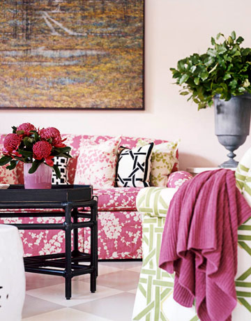


And you know what? Honeysuckle compliments turquoise quite nicely so if you're not ready to ditch 2010's colour you don't have to :)

Images via here
What do YOU think about Honeysuckle, would you use it or wear it? Would you be so bold as to paint with it? I'd love to know.
Have a nice Tuesday,

love honeysuckle i think i can get used to this color in my home xx
ReplyDeletemaybe if i had a little girls room i would definitely paint with it xx
ReplyDeleteFor the last 2 years I have been umming and ahhing about repainting my daughter's bedroom. The colour (which she chose about 4 years ago) was, you guessed it -"Honeysuckle"! Although I loved the shade - the whole room painted in this colour was, well.... somewhat overpowering. (My son actually said the colour made him feel quite agitated everytime he walked past!) So, the week before Christmas I did a complete re-paint of the room in Antique White USA (took me 3 coats to completely get rid of that Honeysuckle....) Although the AWUSA looks lovely and clean and fresh - it does look a little "boring". I still have a can of "Honeysuckle" in my shed. Will have to see what I can do with it now - particularly after your inspiring post Janette! ;)Sharyne
ReplyDeleteI really like the colour and agree that it goes really well with turquoise. I'd be happy to wear or decorate with it. In fact the colour really reminds me of the raspberry filling I made for biscuits yesterday!
ReplyDeleteI'm a real scaredy-cat when it comes to using bright bold colours in our home :) Pink is one colour I don't decorate a lot with although I love that first inspiration pic and since having a girl, I must say it's slowly growing on me :)
ReplyDeletePantone do a colour of the year? Huh! cool! :) I rather like this honeysuckle and would absolutely wear it and decorate with it if I didn't live with a Mr who thinks pink is the domain of girl only households! I tried to work pink in to the backyard (painting a wall or similar) but he wouldn't even have that. And, I love turquoise and pink together. If I have a little girl it's the colours I'll do in her room.
ReplyDeleteIt's lovely, I would use it and wear it.
ReplyDeleteHoneysuckle is a lovely colour and it does look very nice with turquoise. I hope you are enjoying your break from work and I think that after your busy year you definately deserve it. I pray that you have a wonderful year ahead Janette and that My Sweet Prints just gets bigger and bigger! xx
ReplyDeleteI love pink too and would probably both use and wear it. I love the pink bed image. ;-)
ReplyDeleteI love the combo of aqua and honeysuckle...maybe I'll be brave enough to go beyond just pillows! Love the blog!
ReplyDeleteLove the new colour, although I definitely need the hints on how to use it! Happy new year Janette, hope its fabulous for you! Hugs, Emma.
ReplyDeleteHi Janette. I've just done 'A decade of Pantone Colour - 2000 to 2010' on my blog. Yes, Cat, pantone do a featured colour every year. Although not a 'pink' fan I do like Honeysuckle, but last year's Turquoise was my favourite....Terese
ReplyDeletehttp://designed-to-a-t.blogspot.com
Hi Sweets I think honeysuckle is really pretty, even although I'm *so* not a pink girl. Hmm, I would use it in a painting but not to paint a wall ☺. J x
ReplyDeleteI am more of a blue fan myself but this colour does add vibrancy and looks great with the navy in the bedroom above. G
ReplyDeleteThat's a beautiful colour, but probably a little bold for boring old me. I could never wear it. We only wear black in Melbourne you know.. well, actually I wear a lot of white! It is used very well in the images you've posted though. Rachaelxx
ReplyDelete